And where it stands in an Agile approach.

This article was originally published in Design & Critical Thinking.
The “design process” aims to ensure a human-centred design approach, as well as to ensure the consideration of the needs (sometimes not expressed) of users and the context in which they evolve. We, therefore, define success criteria based on the users’ expectations and needs, which enable us to generate ideas, define KPIs, and develop a product that will not only be suitable but will have a strong added value (Value Proposition).
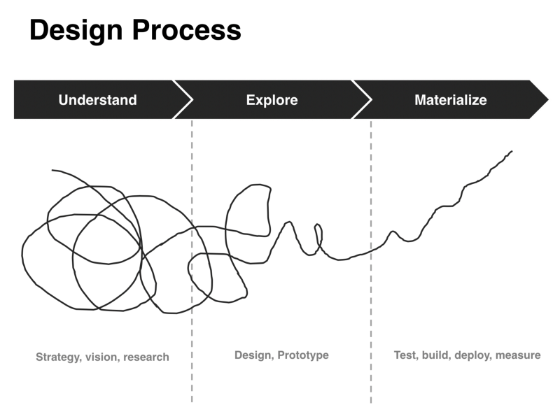
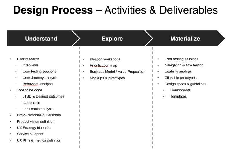
As a reminder, the Human-Centered Design (HCD) is a formalized process that includes tasks that guide UX specialists through user research, design, prototyping, testing with real users, and iterations based on what we learned from the tests.
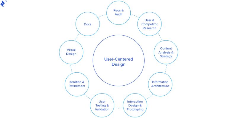
This approach also ensures that the “innovation” part of a project/product does not focus solely on technological aspects. The word “innovation” is sometimes brandished without understanding the issues: an innovation in technological terms does not necessarily mean an innovation for the user and vice versa.
For example, the blockchain is mainly a technological innovation for the change of concept it implies, but it is not (yet) innovation for the users: there is not yet an application of the blockchain which has really made a large-scale change or impact in our day-to-day lives as human beings (at least, at this time of writing).
To put it another way, my neighbor will probably not use cryptocurrencies tomorrow, but she is more likely to consider buying an electric car like a Tesla.
Besides, Tesla understood what no other car manufacturer (at the time) did: the users and their contexts. Tesla fully understood that the biggest obstacle to buying an electric car was the fear of falling out of batteries in the middle of a trip. They have, therefore, built an innovative Business Model (BM) around this understanding of their users.
Example #1: Tesla’s navigation system will always make sure to offer you the most efficient route while passing near charging stations, depending on your current and anticipated consumption. So you can ride with confidence.
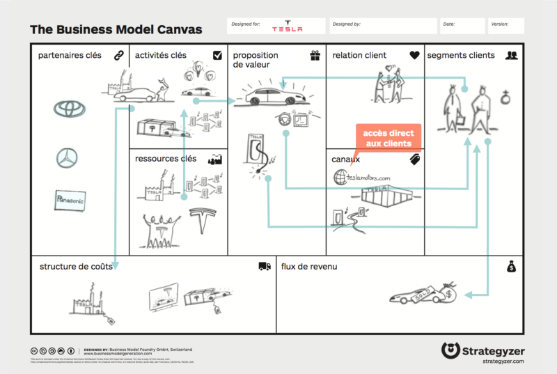
Here, the innovation lies primarily in the Business Model, as it answers in a different way to the user’s problem and articulates through technology (technology as a medium).
Example #2: Tesla’s infrastructure of fast charging stations mainly exists to serve the Business Model and thus increase the ability of a user to charge their car quickly (and previously for free) at any time — here again, to reassure the user. All other features of Tesla’s products serve to increase user gains.
Example #3: Tesla’s huge screen-tablet in the center of the car clearly shows the state of charging of the vehicle and its easiness of use, close to an iPad’s one, are intended to reassure the user (again).
Tesla is a good example of UX, from strategy to implementation, fully coherent.
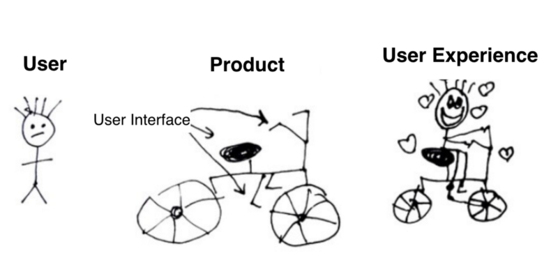
“The user experience exists, whether or not there is someone to take care of it.”
To design a product — whose value proposition (see here) is aligned with the needs — which is viable, desirable, useful, usable, and why not innovative, it is above all a question of teamwork, methods, process, and good communication. This means that it is not because a person “takes care of the UX” that the products will necessarily be “better”.
I think we must be aware that this is an effort everyone must agree to make at their level. This requires everyone to be properly sensitized, have the right reflexes, have access to proven methods, and acquire a certain maturity in the field. UX is not the “thing” of a single person, but a common effort for which the UX specialist brings tools, methods, support, etc. in the form of a partnership with stakeholders, while ensuring a degree of autonomy.
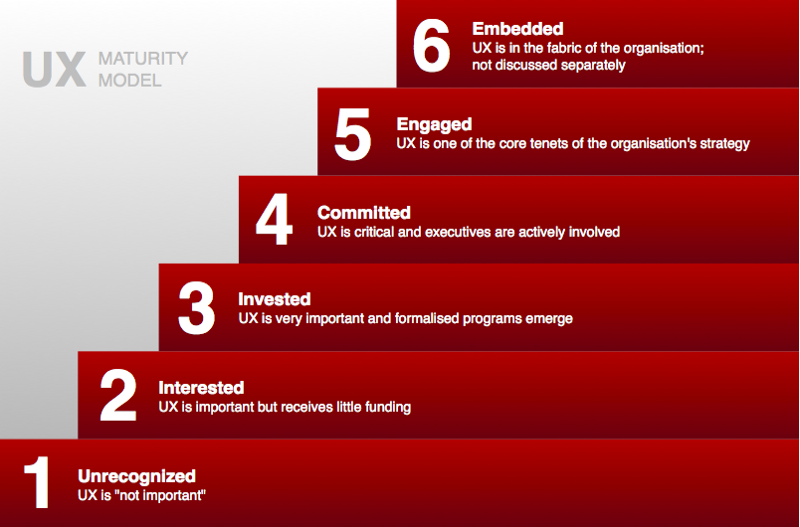
So yes, UX –and human-centered approaches in general– requires taking more time upstream. Yes, it requires managing our natural impatience to start as soon as possible to build and develop the product. But everything we do early in a project to clarify needs, define criteria and KPIs that make sense for users, and build a vision of the desired experience, the more we reduce the risks of developing something that from a technological point of view may work perfectly, but will fall short regarding users needs. See this as a medium-long term investment.
“What cost 1$ to be changed in a prototype, costs 5$ in development and 20$ in production.”— Paul Boag, UX & Service Design Consultant
IBM (see here and there), Salesforce (here and there), Airbnb, Uber, et many others invest heavily in recent years in UX practices and more generally in human-centered approaches. Why? Because it reduces costs and counter-intuitively reduces the time to market. It also brings a measurable competitive advantage to companies that practice and masters it.
“In 2013, the Design Management Institute (DMI) devised the Design Value Index (DVI), an investment tool showing that companies that integrate design thinking into corporate strategy can outpace industry peers by as much as 228%.”
— Fortune, on a report from the Design Management Institute
As you can see, it goes far beyond the “visual” (or UI) aspects of design. Here, we are talking about a mindset, a corporate culture, processes, and methods applied at all levels of an organization.
Even the European financial sector –known for certain inertia towards adopting new concepts– heavily invests in UX, with more and more UX teams and Design services implemented within banks. Some few examples in the European banking and financial sector:
- Orange Bank, the French online banking created in one year by a telephone operator (thanks to the partnership with Groupama) and using a human-centered approach (UX + Design Thinking).
- Revolut, the multi-currency credit card service, uses a human-centered approach.
- TWINT, the Swiss cashless payment service hired a UX agency to develop its product.
- Monzo Bank, the rising star of the UK online banking stage, uses the UX method since its creation.
When Agile Meets UX: Agile UX
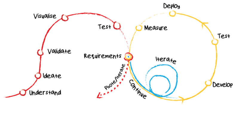
For a long time, those who practice UX methods have sought to integrate with Lean, Agile and Scrum practices. This gave birth to Agile UX and Lean UX, a kind of marriage between the two worlds.

The idea is basically to practice a “Sprint 0” (as soon as possible) that can last a few weeks to a few months, to go into the loop of the UX process and then deliver to the devs elements “ready” to be developed. The result is a product developed more quickly, with higher quality and an increased value proposition, for each Sprint.

Clarifications
The approach, methods, tools, activities, and deliverables that I propose are standards in the industry. The paradigm shift offered by the approach and the associated issues are well established and discussed for a long time in the field. You will thus find several references and sources supporting the various arguments presented here.
One of the founding principles of the approach is that if a user interacts with a product or service, then one must understand the user and its context upstream in order to propose something that fits. So you probably can question how to integrate UX practices into your existing processes, but alter this basic premise — for example, by not taking the time to do user research upstream — and the quality of the result cannot be guaranteed.
As a little reminder, here is a summary of the User-Centered Design Principles (ISO 9241–210):
- Take into account the users from the beginning, their tasks and their environment (context).
- Active participation of the users to guarantee the fidelity of their needs and expected outcomes related to their tasks.
- Proper repartition of the features between the users and the technology.
- Iterate on the design solutions until satisfaction of the needs and expected outcomes expressed by the users.
- Contribution of a multidisciplinary design team aiming for optimal user experience.
Conclusion & Discussion
Beyond project management, UX is also a way to better inform business decisions and certain technological choices by creating a clear understanding of the users, their context, and the interweaving of the touch points between them and the different technological systems, services, and products.
Different metrics should be put in place in order to correctly measure the current and future user experience, and thus to see its evolution. Therefore, some tools should be put in place, and a simple and effective way for the users to give direct feedback should be implemented (i.e. analytics, in-app satisfaction form, surveys, etc.).
Thanks for reading!
This article was originally published in Design & Critical Thinking.




Discussion